
Documentation

Documentation
How to use this document:
Use this page as a reference. All available classes are used here. Copy and paste the class names into the class section of an element's opening tag.
Example Code:
<p class="fontLobster fontMedium red">Hello World!</p>
Results:
Hello World!
If you can't figure out the class. Right click to select and use your browser's "Inspect" mode to target an element and view it's relevant classes.
Font Sizes
Default Font Size
Heading
Subheading
fontXLarge
fontLarge
fontMedium
fontSmall
fontXSmall
Font Families
Default Font Family
fontMeddon
fontSpecialElite
fontOxygen
fontLobster
fontMillGoudy
fontMontserrat
fontPacifico
fontRoboto
fontRanga
fontOpenSans
Font Decorations
Use class="capitalize"
to capitalize the first letter of each word.
Use class="uppercase"
to capitalize every letter.
Use class="lowercase"
To Make Every Letter LOWERCASE.
Use class="bold"
to bold the text.
Use class="italic"
to italicize the text.
Use class="underline"
to underline the text.
Colors
Default Font Color
Black
White
Blue
Yellow
Green
Purple
Pink
Red
fontShadow
Background Colors
Default with class="border"
bgBlack
bgWhite
bgGray
bgBlue
bgYellow
bgGreen
bgPurple
bgPink
bgRed
Images
To insert images:
Use the image tag correctly. And add the class "image-responsive" if you want it to resize with the browser window.
Example Code:
<img class="image-responsive src="images/example1.jpeg" alt="example 1"/>
Results:
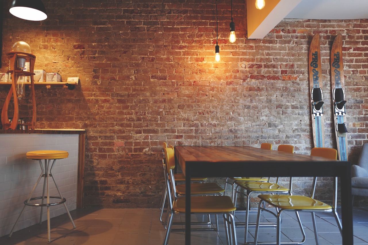
This is image has the class="image-responsive" and it resizes as you resize the page. Try it!

This image is not responsive. It will disappear off the page at smaller viewports.

This is an image at normal opacity.

This is an image has 80% opacity with a class of "seeThrough".

This is an image has 60% opacity with a class of "seeThroughMore".

This is an image with class="grayScale".
This image is contained within a <div> with the class of "flip-card".
Hover on it and see the code below:
                <div class="flip-card">
                    <div class="flip-card-inner">
                        <div class="flip-card-front">
                            <img src="images/example1.jpeg" alt="example 1">
                        </div>
                        <div class="flip-card-back">
                            <p>Food Food Food</p>
                        </div>
                    </div>
                </div>

Food Food Food

Drink Drink Drink
Background Image
How to Use:
Place your image in the "images" folder.
Find the "background-images" section in the "main.min.css" file "SCSS" folder.
Alter the file path from any of the background-images (i.e. "background-image1.jpg") to the image you wish to use.
Then use that class (i.e. class="background-image1") on your <div> element!
This background image allows for other elements
LIKE TEXT
to lay on top of it
Tables
This is a table that uses the "bordered" class:
| Company | Contact | Country |
|---|---|---|
| Alfreds Futterkiste | Maria Anders | Germany |
| Centro Comercial Moctezuma | Francisco Chang | Mexico |
| Ernst Handel | Roland Mendel | Austria |
| Island Trading | Helen Bennett | UK |
| Laughing Bacchus Winecellars | Yoshi Tannamuri | Canada |
| Magazzini Alimentari Riuniti | Giovanni Rovelli | Italy |
This is a table that uses the "striped" class:
| First Name | Last Name | Points |
|---|---|---|
| Peter | Griffin | 100 |
| Lois | Griffin | 150 |
| Joe | Swanson | 300 |
| Cleveland | Brown | 250 |
This is a table with the "responsive" and "bordered" class:
| First Name | Last Name | Earnings |
|---|---|---|
| Peter | Griffin | $100 |
| Lois | Griffin | $150 |
| Joe | Swanson | $300 |
| Cleveland | Brown | $250 |
Flexy Grid
This is the flexy grid,this grid is responsive!
Use the html starter code below, along with the class names indicated in the below example to create the flexy grid.
             <div class="flexWrapper responsive">

            <section>
              <div class="gridHorizontal">
                  <div class="gridFull column">
                      <header> class="gridFull" </header>
               </div>
            </div>

            <div class="gridHorizontal">
               <div class="column gridHalf">
                  <section> class="gridHalf" </section>
               </div>
               <class="column gridHalf">
                  <section> class="gridHalf" </section>
               </div>
            </div>

            <div class="gridHorizontal">
                <div class="column gridThird">
                    <article> class="gridThird" </article>
                </div>
                <div class="column gridThird">
                     <article> class="gridThird" </article>
                </div>
                <div class="column gridThird">
                     <article> class="gridThird" </article>
                </div>
            </div>

            <div class="gridHorizontal">
                <div class="column gridFourth">
                     <section> class="gridFourth" </section>
                </div>

                <div class="column gridFull">
                     <article> class="gridFull" </article>
                </div>

                <div class="column gridFull">
                      <article> class="gridFull" </article>
                </div>

                <div class="column gridHalf">
                      <aside> class="gridHalf" </aside>
                </div>
            </div>

            <div class="gridHorizontal">
                <div class="column gridFull">
                    <footer> class="gridFull" </footer>
                </div>
            </div>

            </section>
<header> class="gridFull" </header>
<section> class="gridHalf" </section>
<section> class="gridHalf" </section>
<article> class="gridThird" </article>
<article> class="gridThird" </article>
<article> class="gridThird" </article>
<section> class="gridFourth" </section>
<article> class="gridFull" </article>
<article> class="gridFull" </article>
<aside> class="gridHalf" </aside>
<footer> class="gridFull" </footer>
Forms
This is a form.
To use forms:
Copy this html template
Search this site
Layouts
The <div> surrounding this <p> tag has a class="spaceAround" - margin all around
The <div> surrounding this <p> tag has a class="spaceVertical" - margin top and bottom
The <div> surrounding this <p> tag has a class="spaceHorizontal" - margin left and right
The <div> surrounding this <p> tag has a class="spaceInside" - padding all around
The <div> surrounding this <p> tag has a class="spaceInsideVertical" - padding top and bottom
The <div> surrounding this <p> tag has a class="spaceInsideHorizontal" - padding left and write
The <div> surrounding this <p> tag has a class="maxText" ... It prevents the text from extended beyond a width of optimal readability.
The text above is centered within its <div> because the body has class of "centerText", but the <div> is not centered within its container. This <div> has a class="maxText centerObject"... So it IS centered within its container!